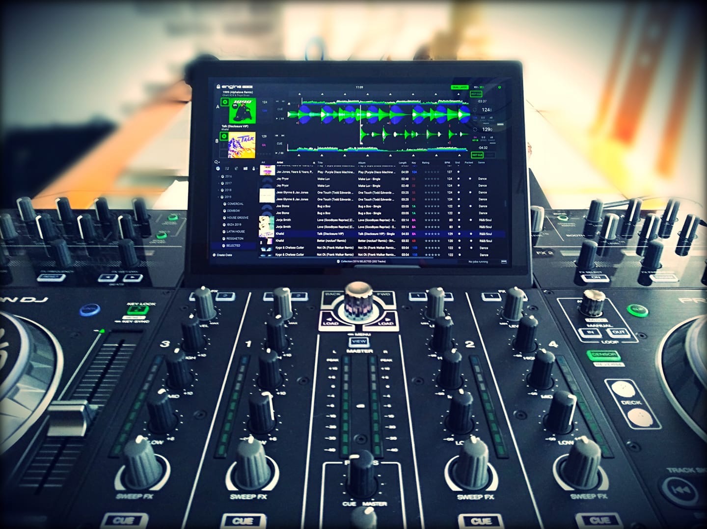
It would be amazing if we had the horizontal layout screen the same as the prime engine software on the computer. Especially for having the library in sight (all together with the waves)
23 Likes
This is a great idea, at the least on paper. Would be interesting to see how it would look if implemented.
You should move your post to the Feature Suggestions area for the Prime 4. Here is the link:
https://community.enginedj.com/c/feature-requests/prime-4
The more ![]() it receives there, the better the chances of implementation/consideration.
it receives there, the better the chances of implementation/consideration.
2 Likes
I agree, that looks great in theory. Font may become to small for my old eyes though.
Put in the feature request, if not done already.
3 Likes
MARK settle over at DJ Worx stated how big the fonts was and I kinda agree a little. I could quite easily reduce some of the size in areas that aren’t touch critical. I like a nice small font to get as much library data on it (even Serato DJ has the small “compressed” waveforms in my version).
It would be interesting as the Prime 10" screen is big but how much can it be optimised without losing some of the touch based gesture stuff? Getting a fine balance would be great.
If the font size is going to change, I hope that the current size is still an option - I like having customizability, and TBH the current font size is great for me.
1 Like
I really love that layout visually, its clean and simple and nice to have access to the library and the playing wave forms.
Not sure if it will work practically as mentioned above but ive always felt that the track listing in vertical mode with 4 wave forms leaves me wanting more and i keep going back to the library view to plan the track after the next one…
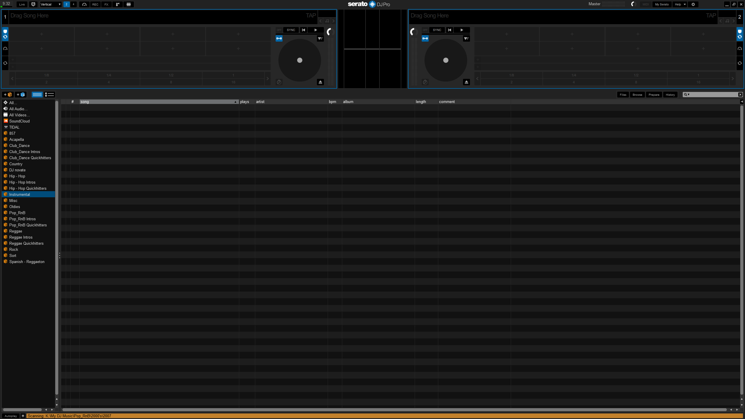
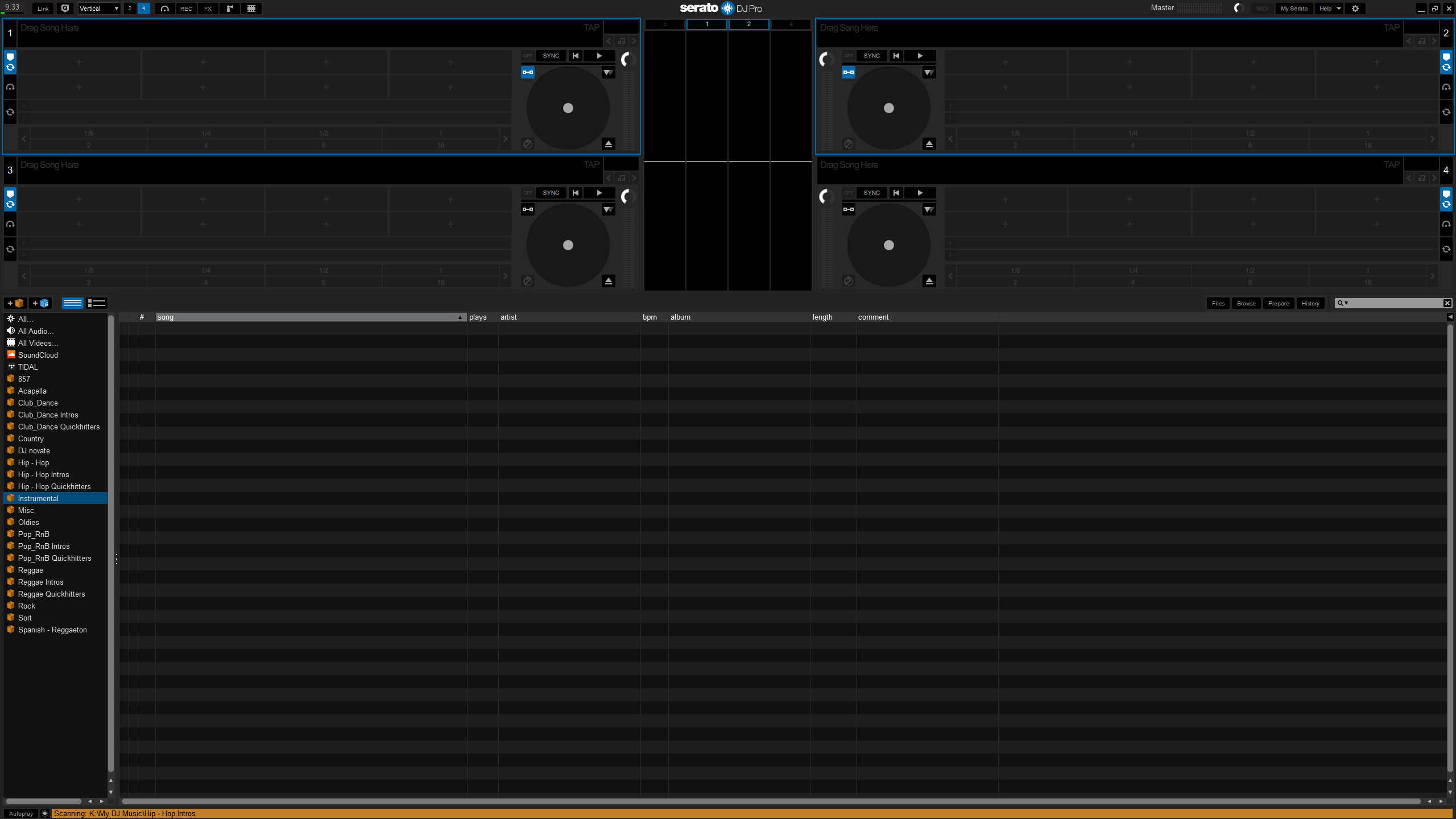
I wish the Prime 4 had these layout options too. That’s the one thing that I miss from Serato. I don’t like how the current waveform and track layout has the tracks on opposite sides. This would still allow them to be close and give you track selection without leaving the screen. Font sizing options would help if the text was too small for some. If the folders on the left don’t fit then take em away and just use the view button to toggle to the screen to change folders. If anything I’d take the Prime Engine layout you have in the OP post too. What do you all think?
1 Like
@djnovate In my opinion, the Prime 4 screen is too small to display all that information: the characters would be too small and the information too confusing.
EDIT: I am referring to the layout proposed above. In my opinion, the current Prime 4 layout is excellent in terms of size and quantity of information.
2 Likes
I agree for me this is perfect, all in the right size to be able to use the touch screen without having to go crazy. I look forward to only the PRE-LISTENING, we hope will arrive taken … then if there will be more, even better.
1 Like
Sorry, approved and removed your request topic as I now see it was already added and partly discussed here.
your purpose is perfect. About the small size of tracking list: the problem can be solved increazing the size of double, like in the vertical view. The browse folder on the left side, my opinion is not needed. But the actual horizontal view is horrible. No art cover, no artist, no info. Who’s made it? Totally illogical.
1 Like
It definitely needs artist at least. Atomix have been far more sensible, and included artist on their VDJ skin.
It’s a shame we can’t skin the onboard graphics. It’s much better to have a choice of layout. I really dislike so much screen space being wasted on scrolling waveforms.
The graphics in the horizontal view show that they launched a sparse and unprofessional visual solution in a short time, this is evident. The problem is that none of them are aware of this.
1 Like